Making of Pansy Club Poster
I was asked to do a promo poster for the next Pansy Club event, and beyond inclusion of relevant event info I was given full creative control. A dream!
But where to start?
Well, by observation. I attend Pansy Club, and so I plopped down at one and started observing and sketching attendees. This sketching turned out to be the essence of what Pansy Club is - Dancing! This is where I start to refine the idea. Dancing is great, but how do we depict that? Full body? Nah. I wanted to draw something simple and visually impactful. A closeup of a body part, something universal.
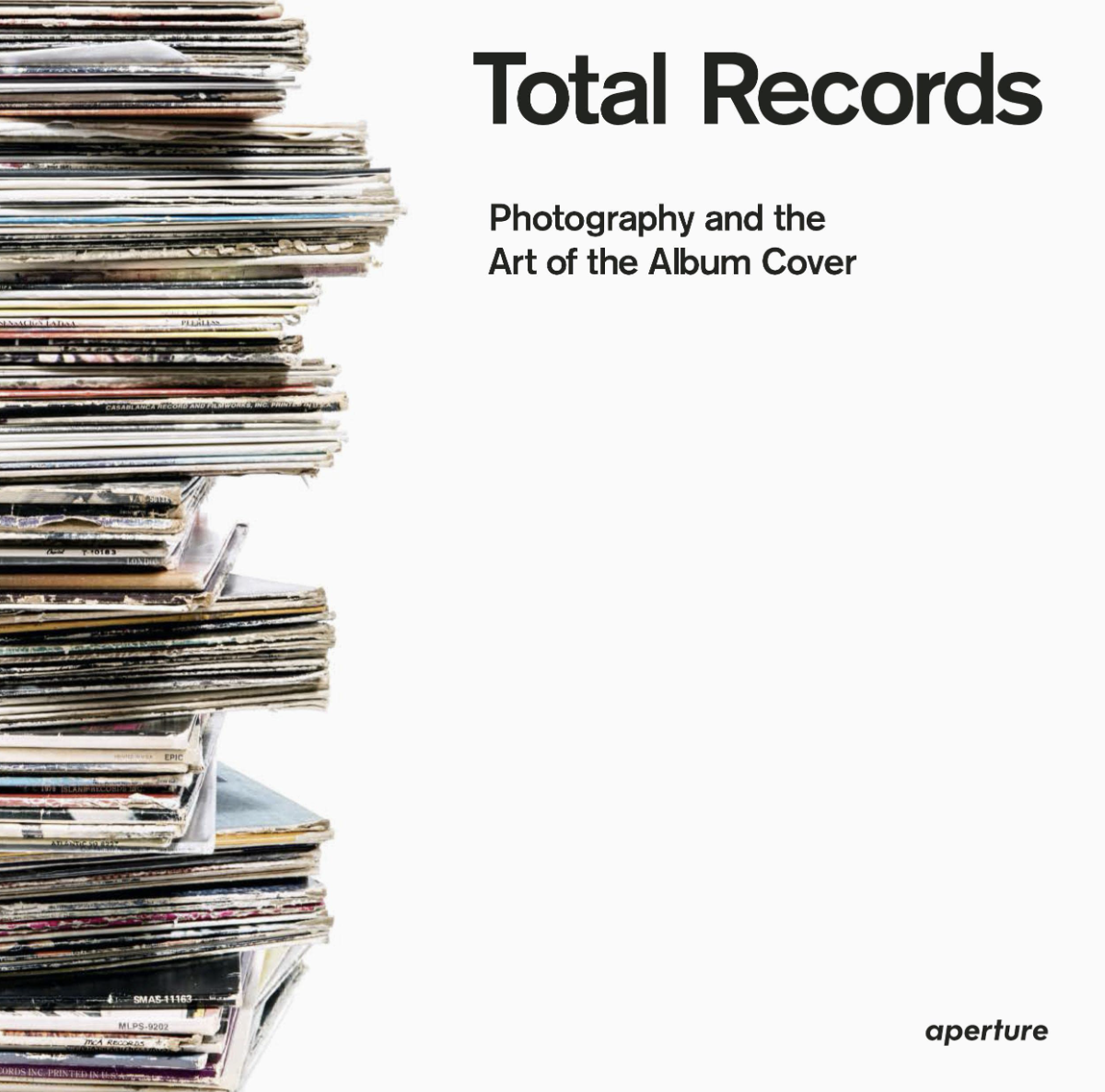
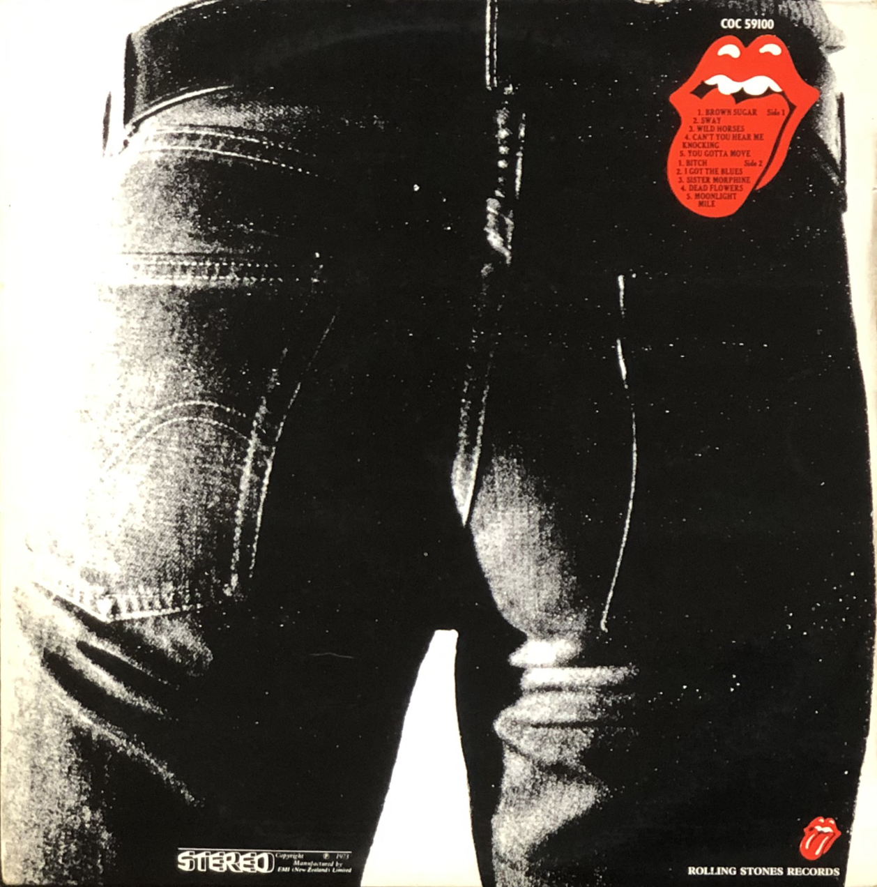
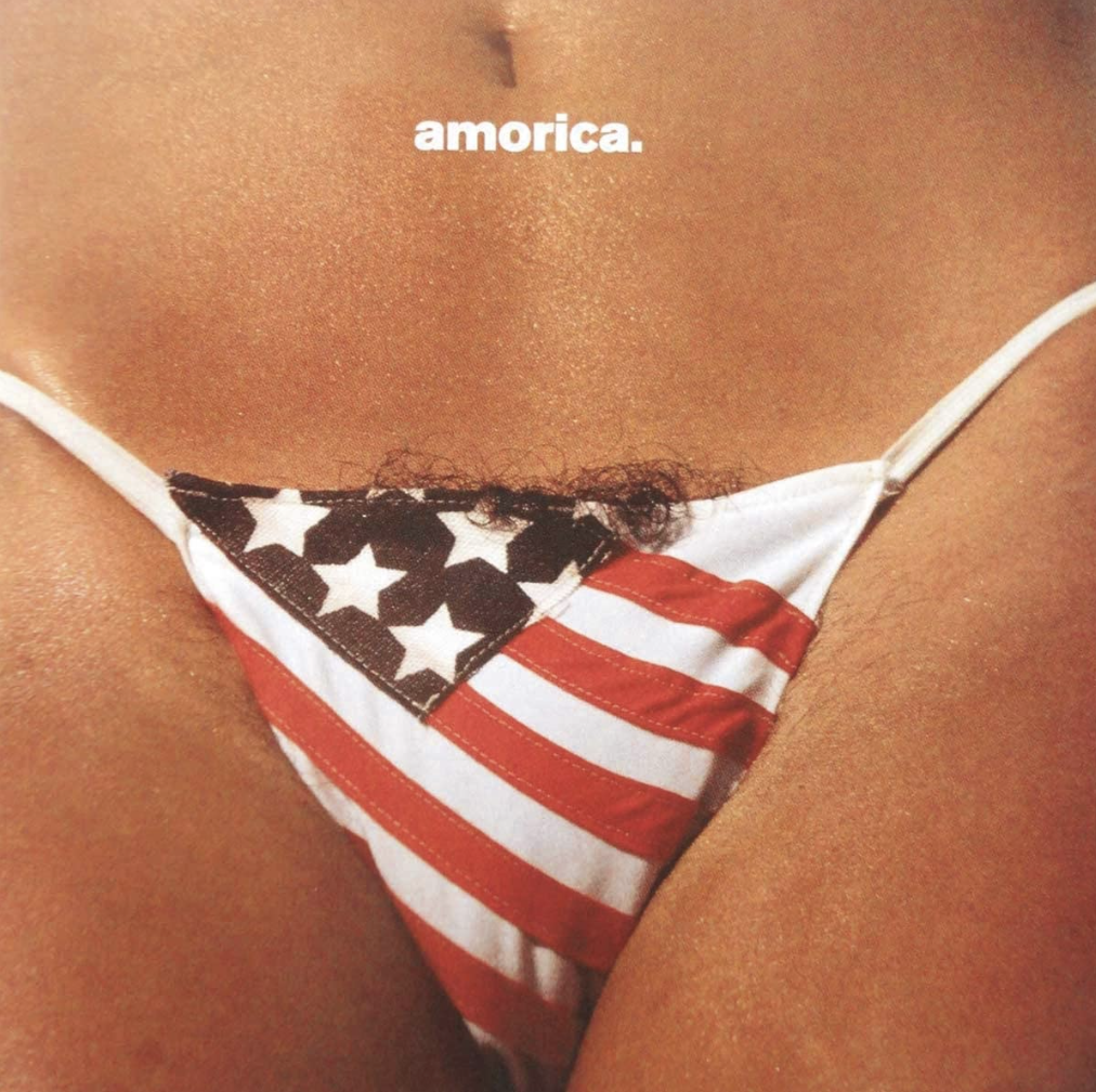
Now, more inspiration gathering. Pansy Club has DJs spinning tunes all night. Music. I’m always taken by the iconography of record covers, and this was a perfect project to explore this further. I have a couple of books showcasing the art of records, and for this one I referred Total Records. A flip through brought me to two album covers: Sticky Fingers by the Rolling Stones, and Amorica. by the Black Crowes.
The back sleeve of Sticky Fingers is solid and graphic while also carrying a sense of gesture via the off-kilter posing of the legs.
The cover of Amorica. is provocative, impactful, and intriguing. The clear messaging is enforced by sparse and centered visual elements.
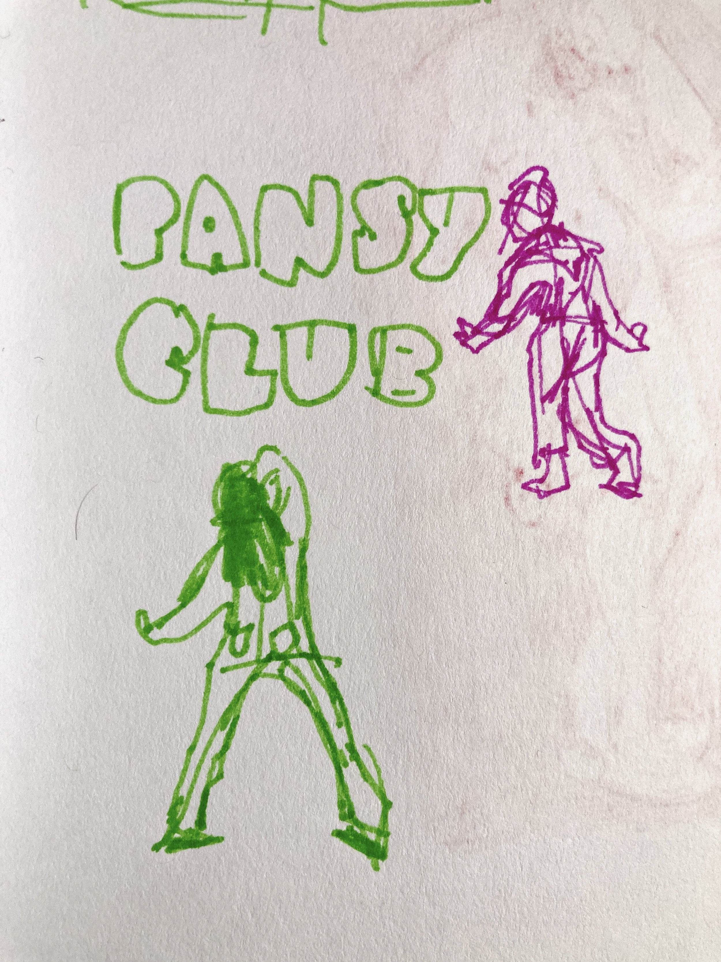
Initial sketch at Pansy Club
Process Video
Time for thumbnails! I played around with the idea of feet in cool shoes (a bit 1950s dance party, also overdone imo), and you can see me ripping off the Black Crowes album in a few thumbnails (too static + overt), but neither of those were doing what I wanted. So I went to the next essential part of a dancing body —the legs and butt. It was a balancing act figuring out how close you could zoom for visual impact without the image losing clarity and gesture.
After this it was a matter of picking a thumbnail and refining the idea further. I knew going in that I would be including information on the body and shorts of this person, so I left adequate space in anticipation of this. You can see in my process video that I start with white and blue. I left a hint of boots and a top on this person to ensure it didn’t feel like an all-out nudie party (as fun as those are). I wanted the gender in this image to be ambiguous and radical, which is why I included body hair, stretch marks, and a muffin top — something I think many people have!
Once I got the drawing down I add color— lots of pink and purple! I was thinking a lot about the presence of disco music at queer parties, and this influenced my color choice as well the initial decision to draw short-shorts, and make them sparkly. My text for the shorts was also influenced by this, bold hand-written type derived from the late 60s and 70s.
As for the tattoos, tons of queers have these kinds of tattoos. Not ones with event info, but tattoos stuck here and there on their bodies, simple images and text that are usually handpoked or done by a friend with a tattoo machine. The function of the included tattoo are primarily intended to be informational, so I tried to make them as legible as possible. I wanted this image to be campy and playful as well as a sexy, which is perfect for a tramp stamp.